By: Abigail Morrow and Isaiah Coleman
Our Presentation:
Content-
Covered the broad strokes really well, but could have also focused more on why it is a Grand Challenge. We think we covered our topics really well and used very current and relevant facts and studies. Although we could have made our point about why making solar energy economical is a grand challenge. We definitely could have tied back to the main point more from each of our subtopics.
Style
We think our presentation had a very professional feel, and had no graphical errors. But we needed to add sources. Our presentation was very clean and precise, but subjectively could have included more images. We feel our organization flowed really well.
Other’s presentations:
1st Presentation Carbon Sequestration
Addressed why it was a grand challenge and then two case studies/ methods, was very clear in their stance and argument. But was not organized in the best manner. Good informative graphic’s that helped their presentation. Needed to balance speakers out more, we only seemed to focus on one person.
2nd Presentation Solar Energy Economics
This presentation had plenty of graphics although they were not always implemented well and addressed why their topic was an engineering grand challenge and why. They focused on the same subtopics as us but spread their presenting out differently. As the presented we could only really hear and focus on one of their presenters, but they were not as extreme as the first presentation we watched. They also seemed to rush the last part of their presentation, it was not as detailed and they seemed pressed for time. But they gave very detailed explanations when they answered questions.
Other Questions
- The other presentation with our topic came to very similar conclusions, and even focused on the same three subtopics, economics politics and technology.
- We don’t feel we had too many preconceptions for presentations. Although we did think we would have more questions after the presentation.
- After seeing other presentations, we would have added sources and possibly more images. For our written report, we will make our argument about the grand challenge much more clear, especially in the introduction. None of the other presentations were particularly striking, they were fine and had well rounded speeches but not stand out. For our presentation we felt we spread the talking out the best in regards to the other presentations we saw.
- We definitely saw some presentation pitfalls, especially with covering text with images, which can be resolved by proofreading presentations before submitting them. Our group has some pitfalls delivering orally with unnatural pauses and slight deviations from the presentation. There were also a lot of different presentation paces either to fast or too slow, although we preferred slow to too fast.
- We found slides with changing text colors very unprofessional but we liked slides that had concise text that was easy to read. In the darkened classroom we found a darker color scheme with light text to be more pleasing to look at.
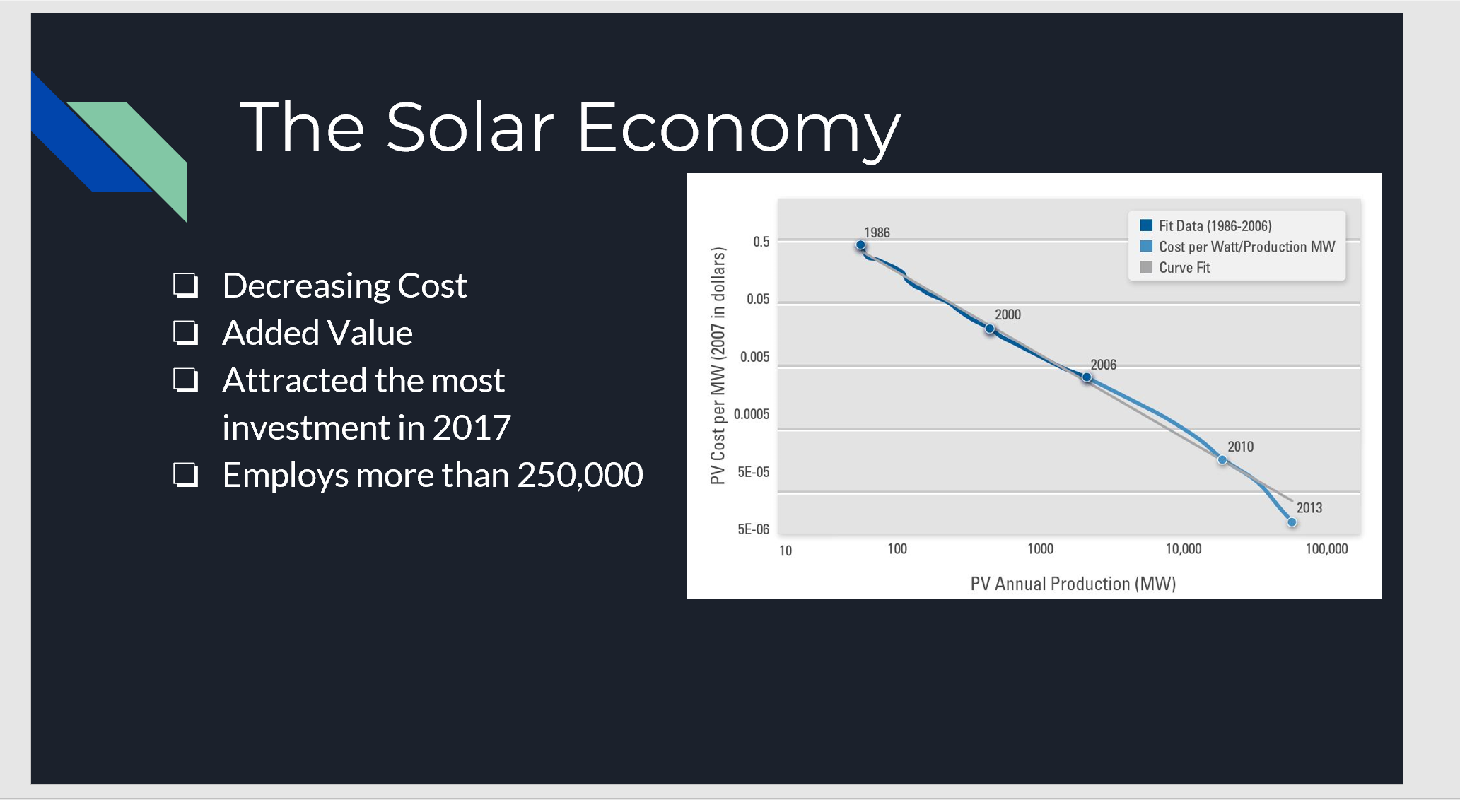
- A definite strong point for this slide is our informative graph. As well as main points in text that were then elaborated by the speaker. This slide could be improved by adding more explanations to the main point as sub bullet points and adding sources to facts and the image.

Good job understanding the need for sources. It helps build and validate your arguments. Also good job recognizing you will need to make your argument for the paper very clear and recognizable. The instructors will be reading multiple papers so the more clear you are the better.
LikeLike